

Pixel Palettes
Amoeba 1.11.25 | Searching for color in slippery places

Hello readers! Today’s post offers a simple attention practice for finding more color in our increasingly bleak world. Enjoy :)
Good morning, earthlings.
Welcome back to the Amoeba: the quiet crackle of static trickling along the transmission lines of Unnatural Heritage. If you’re new here, the Amoeba is the looser, more casual companion to my regular posts. The intention remains the same: to mend the gaps between our natural and digital worlds.
The new year has come and passed, and our predictions for 2025 will soon be put to the test. While I tend to block out all the year-end trend forecasting—it creates too much noise at the exact moment I’m trying to hear myself—one theme kept percolating through my defenses: attention.
Among its predictions for the coming year, the New York Times listed “A Turning Point in the War for Attention” as the number one trend set to define 2025—more influential than pandan desserts, Clinton-core pantsuits, or the triumphant return of wrinkles. The predatory tactics underlying digital media have left us dopamine-addled and in search of our own memories. D. Graham Burnett likens the attention economy to a kind of mental fracking, its various modes of psychological exploitation siphoning up our capacity to experience our own lives. To recognize and attend to the joy and wonder within them.
Attention, taken to its highest degree, is the same thing as prayer. It presupposes faith and love… If we turn our mind toward the good, it is impossible that little by little the whole soul will not be attracted thereto in spite of itself.
- Simone Weil
I’ve been reckoning with my own powers of attention this past year, and I imagine you have, too. Attention audits, attention rituals, attention workshops—attention is poised to saturate the mainstream discourse, likely to the point of nausea. It’s all extremely hopeful. The pervasiveness of the attention revolution marks a turning point in our relationship with the internet—the first maturation of digital society toward something a bit more balanced. I hope we stay with it.
As such, I thought I’d offer a simple attention practice I’ve fallen into organically over the years. It’s a method of documentation that brings me easy and consistent joy, and I hope it might do the same for you. It’s especially good in the winter, when everything seems so dull.
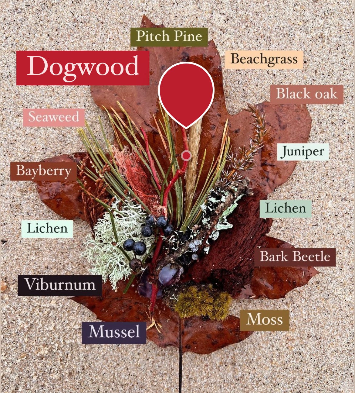
The Joy of Pixel Palettes
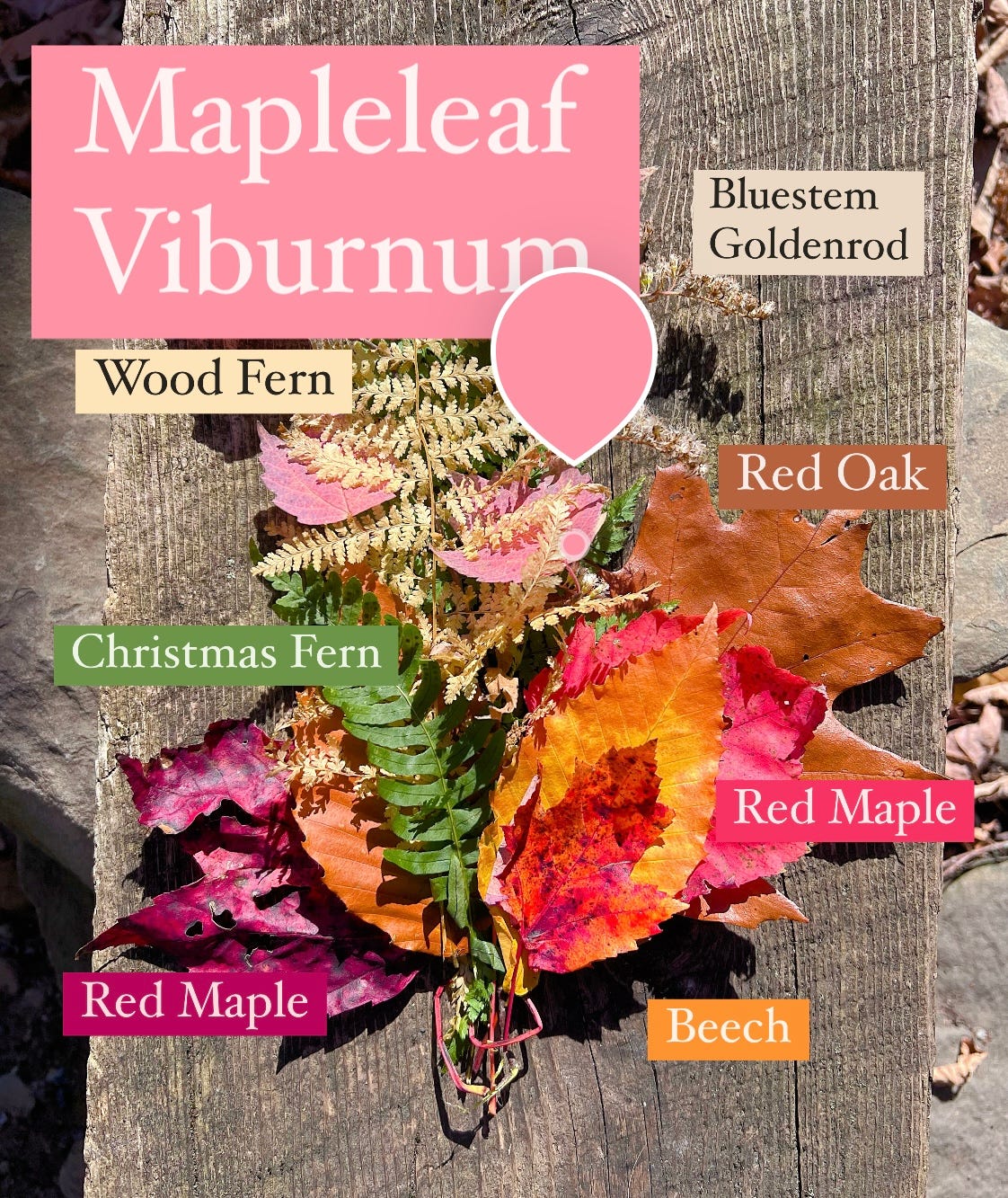
The pixel palette is simple. On your next hike or walk about the neighborhood, gather a small collection of things that catch your eye along the way. These could be leaves, flowers, rocks, even trash. The only requirement is that they speak to you in some way, and that they say something about the place you’re in. Don’t steal or vandalize, and when collecting living things use the forager’s rule: never collect more than 10% of what’s there. If you find a cool mushroom but there’s only three, leave it.
At the end of the walk, arrange the items in a bouquet of your liking, and take a picture. Once I snap my photo, I typically leave my collection out in the landscape, as a kind of offering or devotional. If you gather trash—I mean, human artifacts—then your offering might be placing them in the bin.
The final step is annotation. Using a simple photo editing app, label each element with its name and defining color. I use Instagram’s Stories interface because labeling is super easy, and the eyedropper tool lets me glide around to find the exact color match for each particular object. As I’ll explain later, pixel sampling is an essential part of the process.
If you’re Instagram adverse, I get it. But I find pleasure in weaponizing the app to reclaim my attention. I keep an empty ghost account that I use purely for annotation, and I save most pictures without posting.
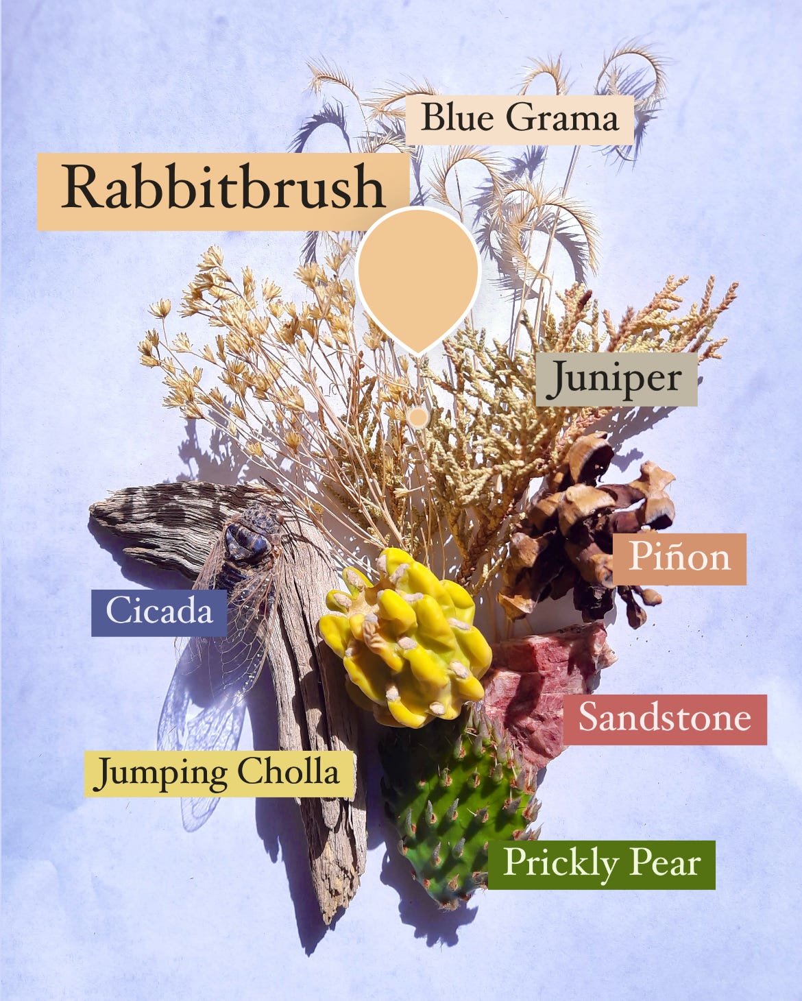
What I love about pixel palettes is that they focus your attention in multiple ways. First, they prime you to notice the smaller things. Those things you can carry and collect in a single hand. There’s a preciousness to it—each item becomes its own little treasure, revealing patterns and textures that weren’t there before. The deep, rigid veins of a fallen beech leaf. The delicate lace of a cicada’s wing.
The act of composing shifts the practice toward narrative. Each bouquet emerges through an attunement to the stories of that place, arranged according to your own interpretation. Don’t overthink it! Usually, a pair of objects will speak out from within the group. Viburnum and wood fern will start whispering in the corner, in delicate shades of blush and parchment, rolling their eyes at the try-hards in the front. Prickly pear and sandstone will assume their usual roles as the vegetal and the mineral, while the pinecone stands just off stage, the understudy for both. It’s not necessarily up to you to write these dramas. Most are already there, so just listen and let them unfold. Things will gravitate into place. If you need to, ask a friend.
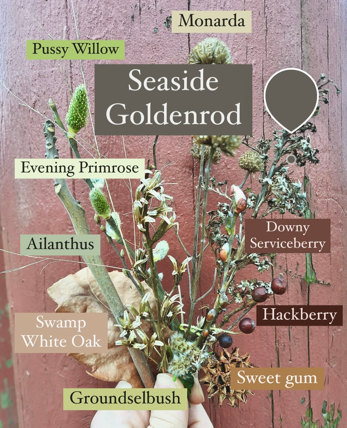
The final step—annotation—is its own process of discovery. It’s the search for a proper name and that essential pigment. I try to get as specific as I can with the plants I collect, labeling down to the species if possible and using ID apps to help me along the way. I’ve learned many plants this way, as well as their personalities across the seasons. Bayberry tends to lose its fragrant leaves here in New York in the winter. But its chestnut buds still brim with excitement for spring.
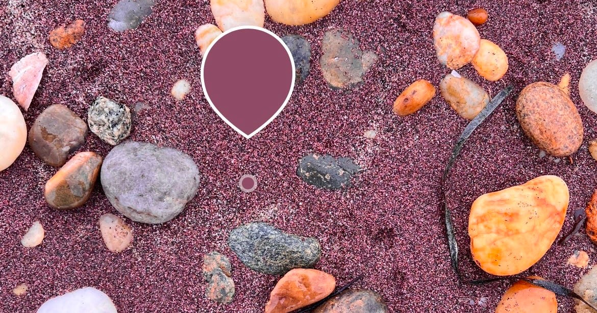
My favorite part is finding the color. Perhaps because it’s always the most challenging. As you guide the eyedropper tool from pixel to pixel, you become acutely aware of the counterculture of hues hiding within the shadows of every object, unbeholden to the human eye. Pine needles—so obviously pine green—are in fact composed of cool teals, earthy greys, moonlit yellows, and little embers of cognac. Locating pine green among the thousands of pixels in an image is, well, like finding a needle in a grey stack. It’s a delicate dance for my big fat thumb, requiring a bow hunter’s precision and bringing a level of refinement to movements that are typically deadened and indifferent.
Above all, the pixel palette should be easy. I’ve included some of my favorites above, but you could literally just place a leaf inside of an abandoned frisbee. Put a dead flower in a Snapple bottle. Find and name the colors in four broken bits of concrete. It doesn’t matter. Whatever you collect, you will end up seeing differently.
The Glitch as a Way of Seeing
What I like about pixel palettes as an attentional practice is that they harness computer vision to help me see beyond it. Most attention practices encourage you to chuck your phone into the ocean (temporarily, at least, though forever is better). Pixel palettes, on the other hand, ask us to reimagine the tool. Not only does the landscape reemerge as a place of discovery, but the image of it does, too.
Digital culture is so exceedingly visual: torrents of images flowing unimpeded through a frictionless ether. They emerge on the screen as powerful apparitions, freed from the weight or purchase of paper. Like all images, they take hold of us—yet we are unable to grasp them in return.
For me, pixel sampling rematerializes the digital image in some way, dissolving its aura into a thousand grains of sand. These grains trickle down into the machinery of my mind, wedging themselves between the gears and slowing down my patterns of thought. Pixel palettes share their spirit with glitch art in that both practices work to interrupt the cohesion of digital media, picking it apart into discrete elements or artifacts. The totality of the image can no longer be taken for granted.
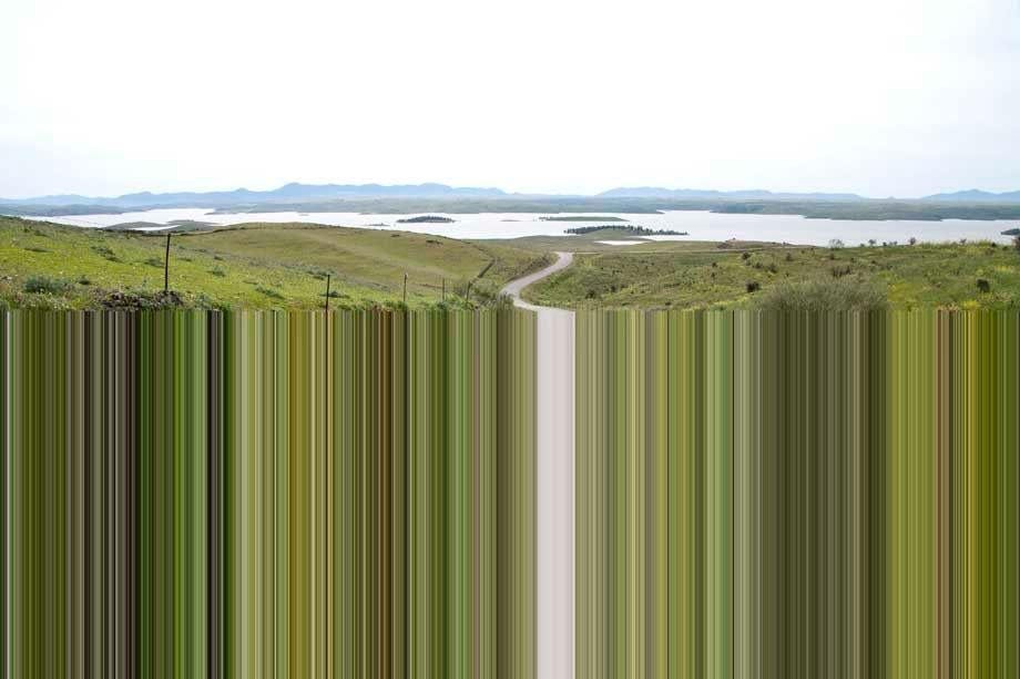
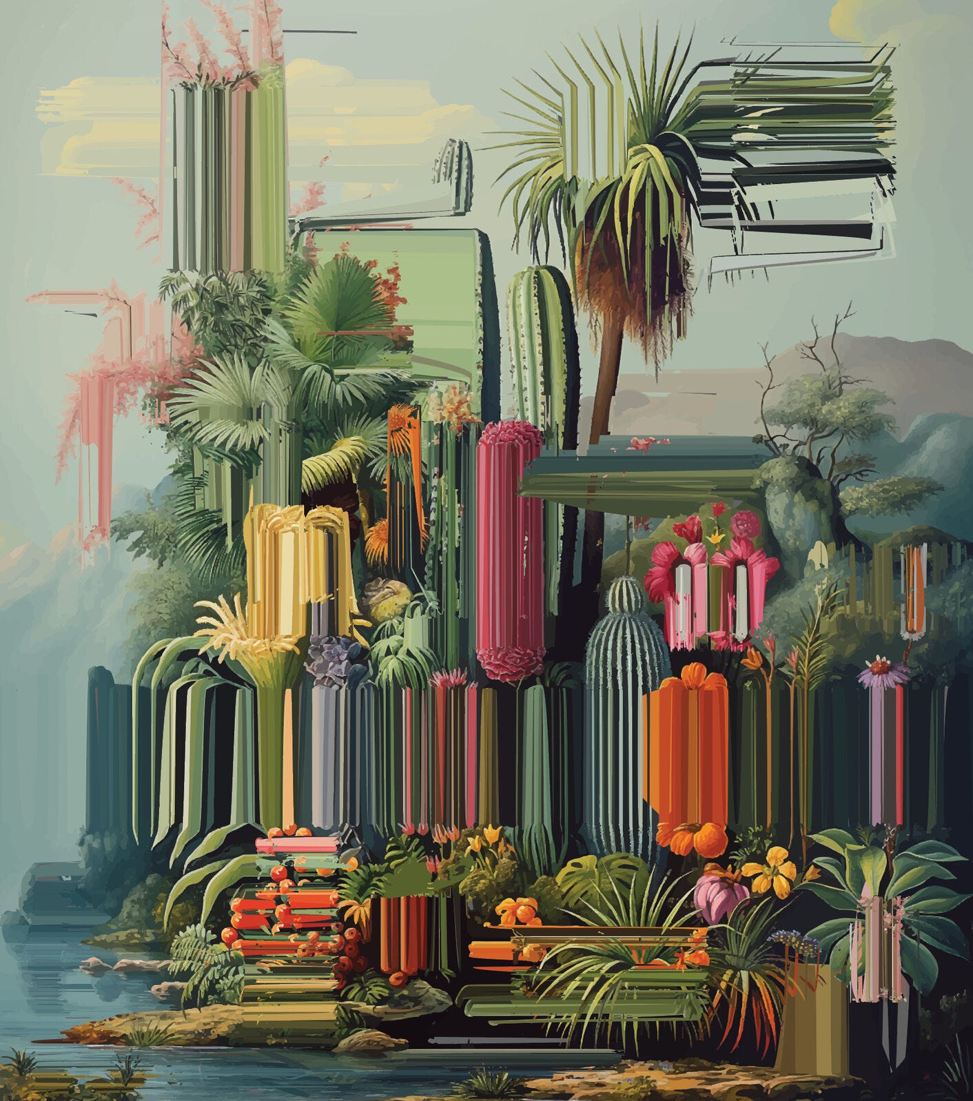
In his Limited Area series, photographer Robert Schlaug extends the pixel palette across the entire horizon. His natural landscapes snag on the screen, the pixels stretched scrollward into a landslide of individual colors. It’s a subtle nod to the original glitsh—a Yiddish word for a slippery place. Artist Alexis Mata deploys a similar technique in his oil paintings, using long, precise brushstrokes to ground our digital disorientation onto the physical canvas.
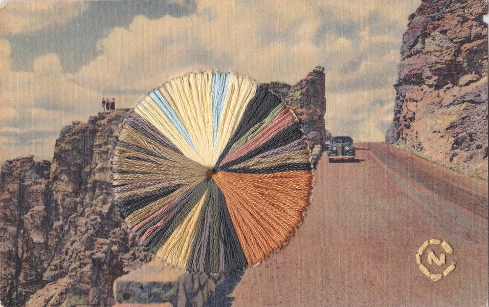
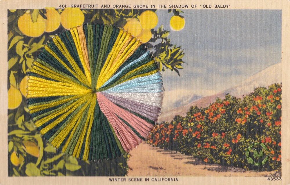
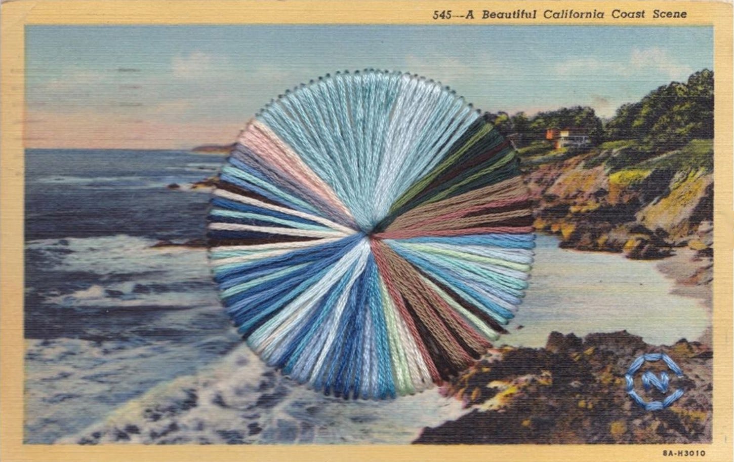
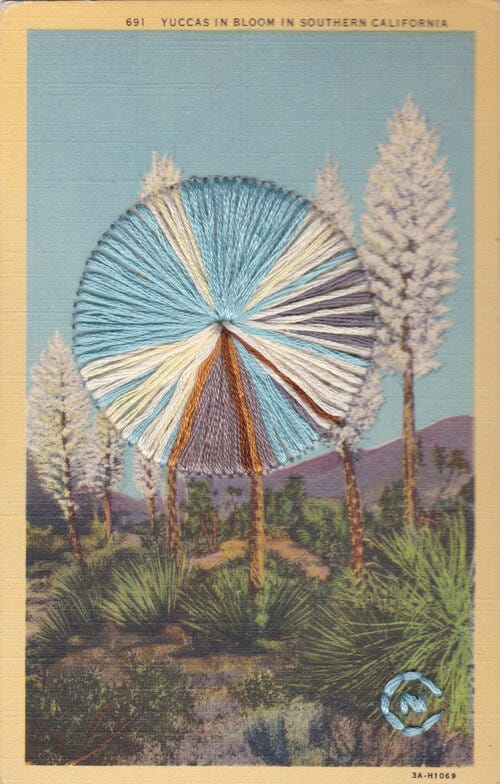
The idea of physically manifesting digital phenomena invites the pixel palette to come full circle. Fiber artist Natalie Ciccoricco leads the way with her carefully threaded postcards, which use digital vision to imbue the printed image with even more tactility. Even on the screen, the postcards are hypnotizing—each one offering a wormhole back to our physical reality, lined with a kaleidoscope of soft cotton thread.
Having done pixel palettes for a few years now, I’m still astonished by how perfectly composed the palettes of nature seem to be. The healthier an ecosystem is, the more it tends to sing out in the colors of its own voice. There is nothing, for instance, like the dusty hues of the Santa Fe desert in the summer. Except, perhaps, for a pitch pine grove on a Long Island winter’s day.
Even when the world is rendered in nothing but shades of ash, there are colors out there hiding, waiting to reemerge.
Sending love and support to everyone affected by the Los Angeles wildfires right now. It’s hard to process. If you’d like to support the Los Angeles Fire Department with their efforts to manage the blaze, please donate to the LAFD Foundation here. Additional support funds can be found on GoFundMe here.

This is so gorgeous - thanks for sharing 🧡
This is such a great idea! Definitely going to make some “bouquets” on my next walk. Thank you for the idea!